data mapping
context
This project was developed to analyze the relationship between corruption and societal progress through global data. The brief focused on using design as a tool to translate complex datasets into clear and accessible insights.
concept
The project frames corruption not as an isolated issue, but as a systemic force that impacts economic growth, social equality, and environmental sustainability.
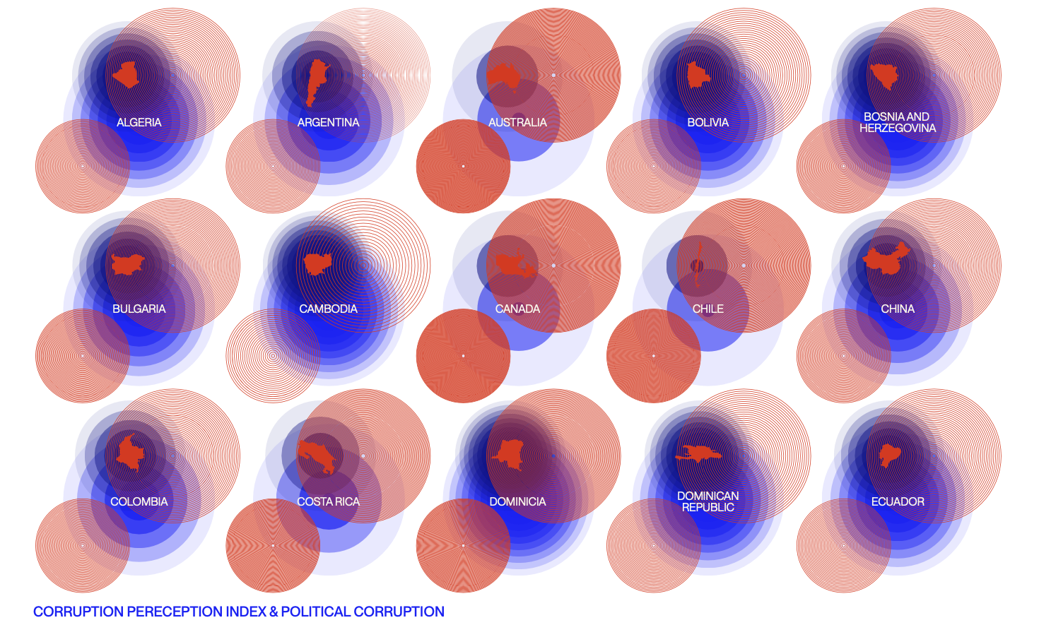
The core idea was to visualize corruption as a layered system, where different factors interact and reinforce one another rather than exist independently.
process
Conducted research on global corruption indicators and datasets
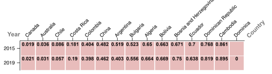
Identified four key areas: political corruption, bribery rates, corruption perception, and land degradation
Structured the project into interconnected visual layers
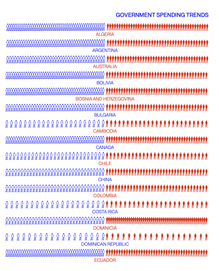
Designed charts, heat maps, and infographics to represent regional and global patterns
Developed an interactive key to support interpretation
key decisions:
Using a layered visualization system to show relationships between variables
Prioritizing clarity to make complex data understandable
Combining multiple visual formats (maps, charts, infographics) for different types of informationDesigning a consistent visual language across all elements
outcome
A data-driven visual system that communicates how corruption affects economic, social, and environmental conditions globally. The project transforms complex information into an accessible narrative that highlights patterns, disparities, and systemic relationships.
reflection
This project taught me how design can function as a tool for analysis, not just communication. I learned how to simplify complex datasets without losing meaning and how visual structure can reveal relationships that are not immediately visible in raw data. It reinforced the importance of clarity, hierarchy, and consistency when working with information-heavy content.