

raelism

context
This project was developed in collaboration with Marcela Cortes, Paola Gutierrez, and Isabel Valero. The brief was to select an existing cult and redesign its visual identity based on its core beliefs and values.
We chose Raelism, a movement centered on the idea that life on Earth was created by extraterrestrial beings known as the Elohim.
concept
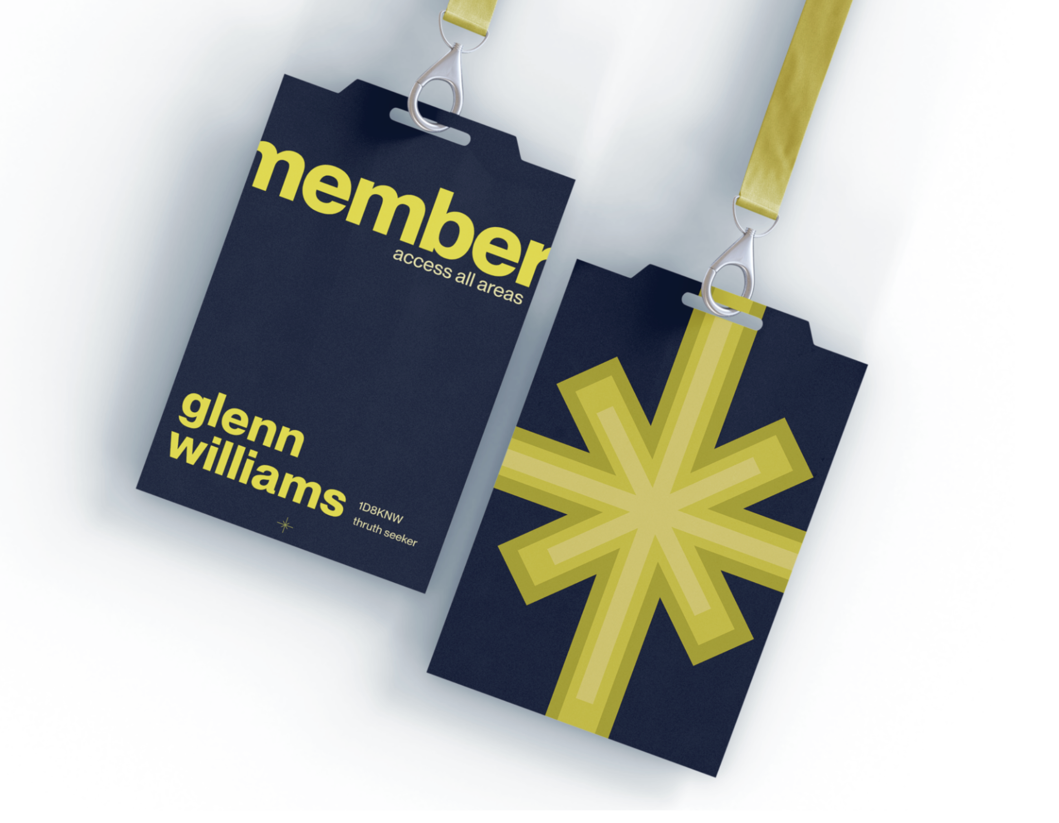
After analyzing the belief system, we identified “cosmic answers” as the central idea. The visual identity is built around a cause-and-effect logic, reflecting how Raelism explains existence through interconnected events and external origins.
The design system translates this philosophy into a visual language based on repetition, duality, and interaction between elements.
process
Researched Raelism’s beliefs, symbols, and communication style
Defined the core concept: cosmic answers through cause and effect
Developed a visual system using repetition and structured relationships
Created a complementary color palette to reinforce contrast and balance
Designed a logo that embodies the concept
Applied the identity across mockups and branded materials
key decisions:
Building the system around cause-and-effect relationships
Using repeating graphic elements to reflect continuity and connection
Designing a logo that functions both as a star and as two opposing arrows
Selecting a complementary color palette to emphasize duality
Ensuring consistency across applications to strengthen identity
outcome
A cohesive visual identity system that reinterprets Raelism through a contemporary lens. The branding communicates its core philosophy through form, color, and repetition, while remaining adaptable across different formats and applications.
reflection
This project taught me how to translate abstract belief systems into visual identities. I learned how to extract a core concept and apply it consistently across a design system, and how branding can communicate complex ideas through simple, repeatable elements.


