the wondeful wizard of oz

context
This project was developed as part of an editorial design brief to redesign and reformat a classical novel. I chose to reinterpret The Wonderful Wizard of Oz by L. Frank Baum.
The challenge was to create a contemporary design while respecting the narrative and tone of the original text.
concept
The project is built around the idea of illusion through typography. Inspired by the Wizard’s deceptive use of spectacle, the design avoids traditional imagery and instead uses text itself to create visual experiences.
Rather than illustrating the story, the goal was to let typography perform the illusion, reflecting the narrative’s themes of appearance versus reality.
process
Analyzed the narrative themes, focusing on illusion and deception
Defined typography as the primary visual language
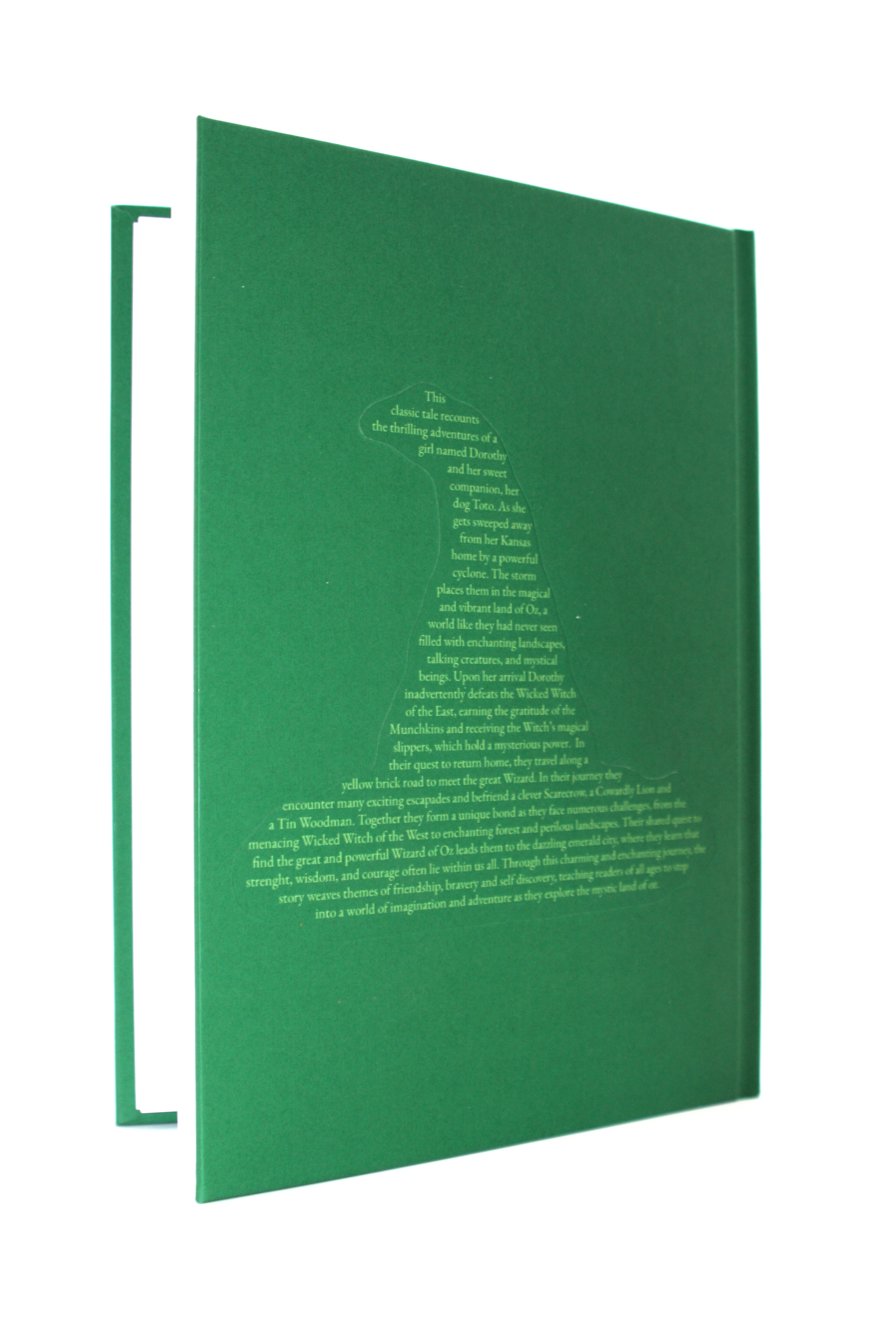
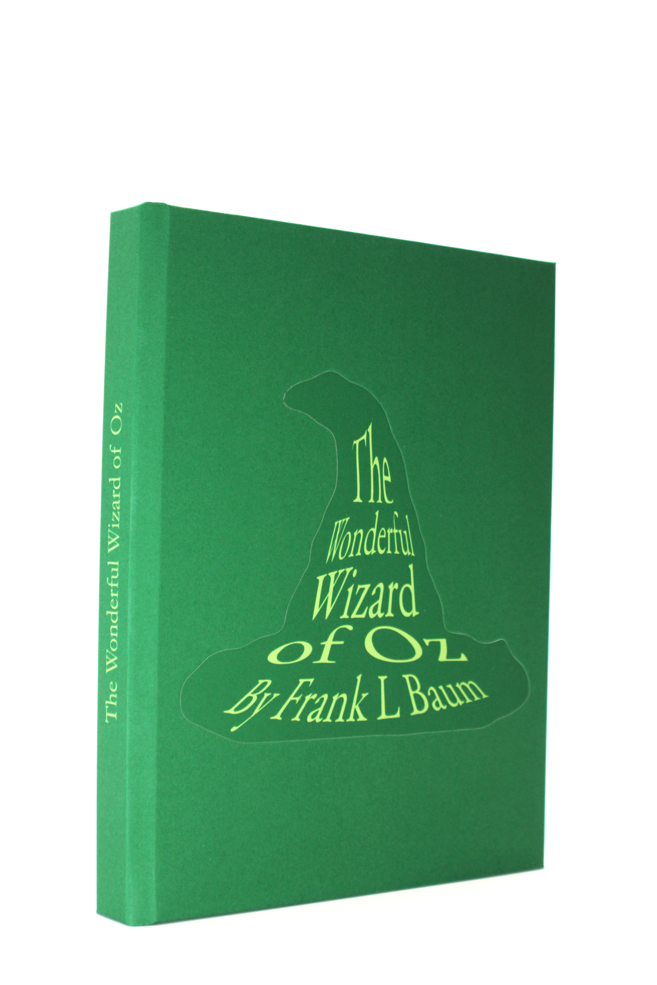
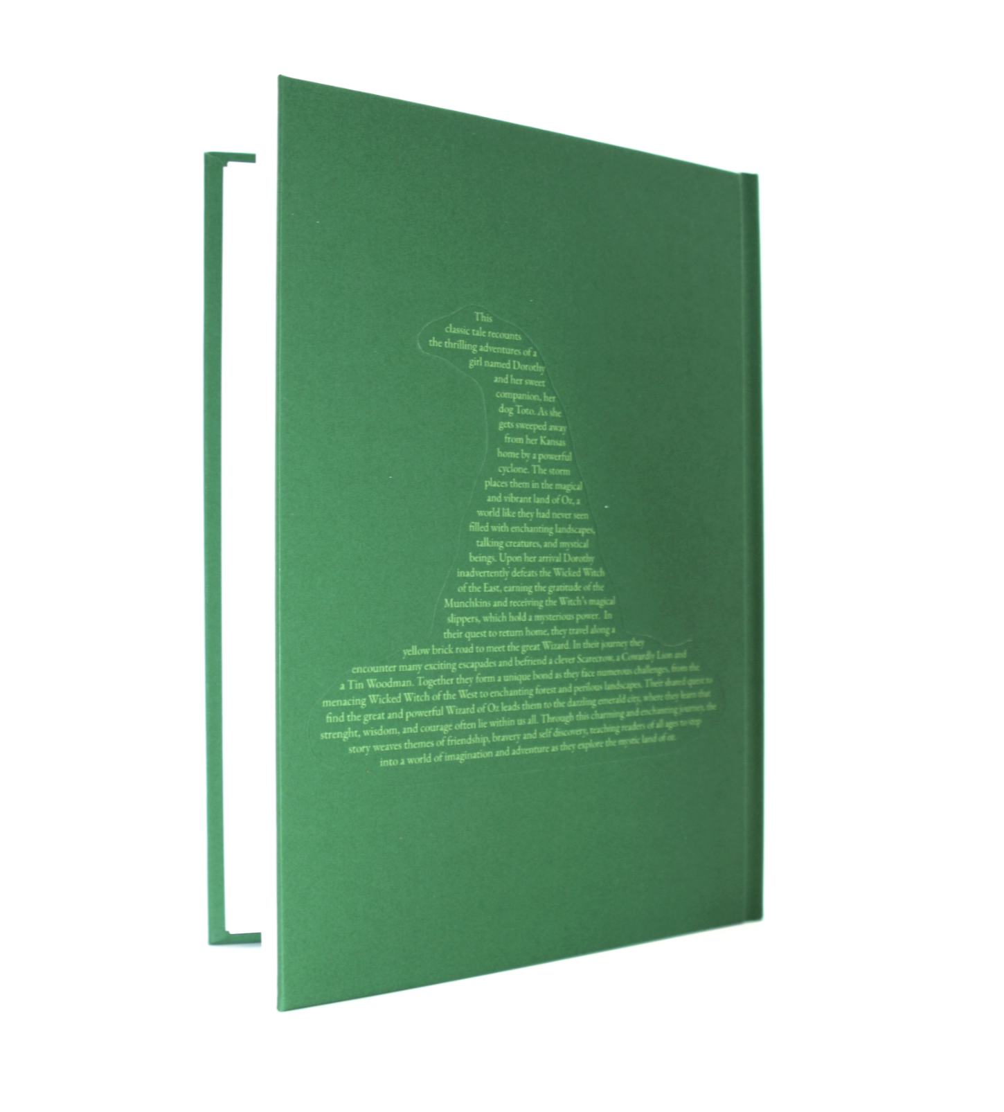
Developed a consistent emerald green palette inspired by the Emerald City
Selected Garamond to establish a refined and timeless tone
Designed typographic compositions for chapter titles and key elements
Extended the system to the cover by shaping text into visual forms
key decisions:
Eliminating traditional illustrations to reinforce the concept
Using typographic illustrations to mimic the Wizard’s illusions
Choosing Garamond for clarity and elegance
Applying a green color system to anchor the visual identity
Designing the cover using text to form the Wicked Witch’s hat
outcome
A fully redesigned publication where typography functions as both content and image. The book maintains readability while introducing a conceptual layer that reinterprets the story through visual illusion.
reflection
This project taught me how typography can go beyond communication and become a storytelling tool. I learned how to build a strong concept and apply it consistently across an entire system, and how restraint, such as removing images, can strengthen a design rather than limit it.